We called it a modest proposal
We called it a modest proposal when we presented it, one morning, end of January 2008, at the headquarters of Europol, Raamweg 47 in The Hague (NL), a building almost completely hidden behind a dense thicket of ivy. A radically modest or modestly radical proposal. It seemed appropriate to combine two words that appear to exclude each other, as our proposal departed decidedly from the usual or customary, but at the same did not.
The construction of the new headquarters of Europol, also in The Hague would take somewhere around two and a half years to built. During this period a wooden fence was intended to be put up around the construction site. We had been asked to develop a work for this fence by the Duch Government Building Agency, as the Dutch Ministry of Justice would be the principal. The neighbourhood was very much against the coming of Europol, we were told. The people were not looking forward to living next to a heavily guarded fortress and feared terrorist attacks, demonstrations etcetera. Because it is not a working-class neighbourhood, their protests were well-informed and strong enough to be able to reach local and national politicians, which delayed the developements a lot. Much to the dismay of Europol who in turn threatened to leave the city of The Hague and consider alternative locations such as Strassbourg. All this made the thing into a little more than just an regular wooden construction site fence. It was almost a border. Politically it is a border, leading into a legal and democratic vacuum, as it is unclear under who's law the area of Europol eventually resides. All is, as one would expect, labeled 'secret'.
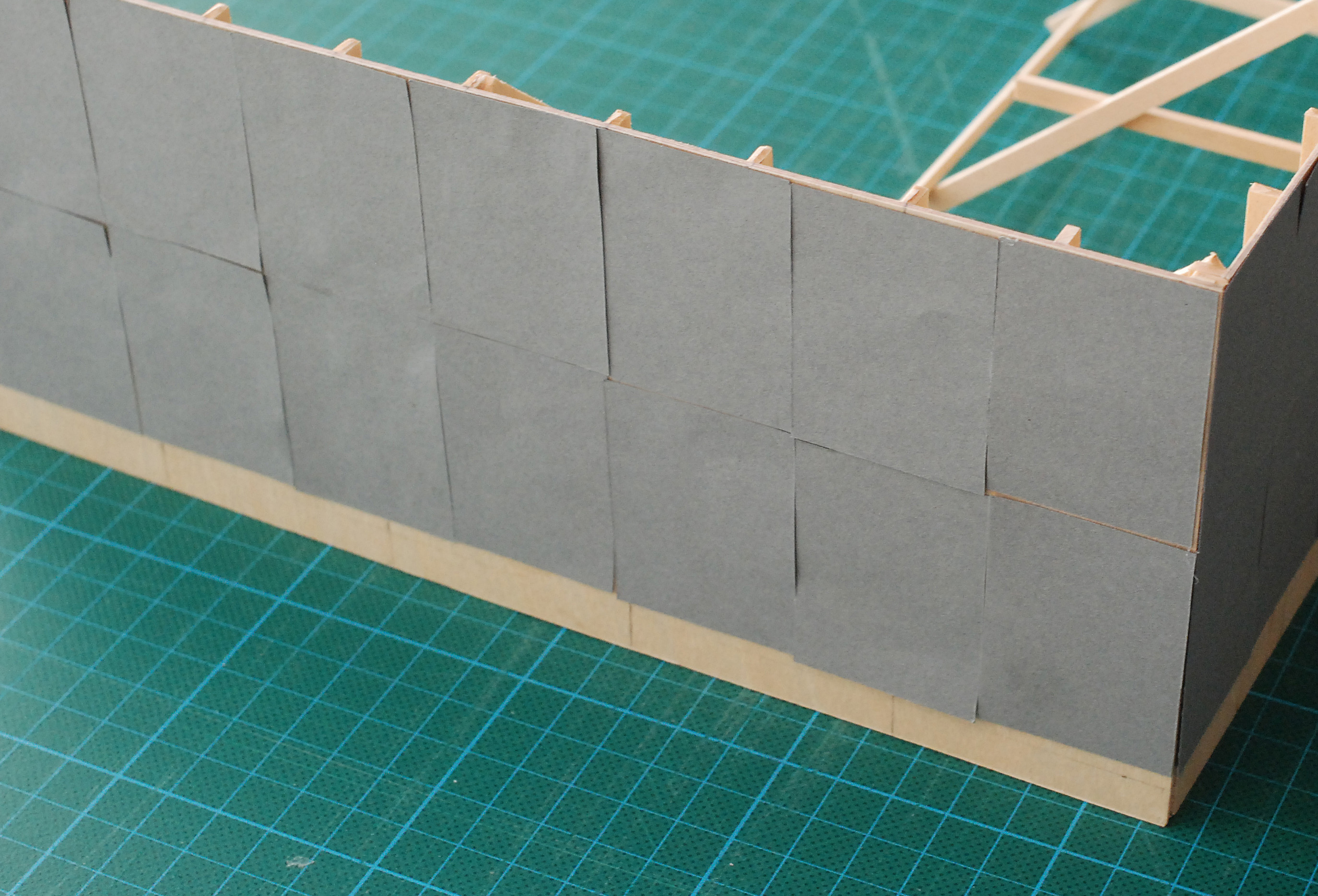
Speaking in public is not our forte, so we were a little nervous, but well prepared. We started by enumerating the most important aspects that we had to take into account. We'll skip that now and jump to our proposal immediately, which was to glue posters over the entire length of the fence. A0-sized posters announcing or advertising nothing but a very specific shade of grey. The posters would be covering the whole fence, from top to bottom and from the beginning to the end, thus producing one big grey monochrome of two hundred metres long and almost three metres high. We continued by saying that the grey monochrome was to be renewed every month, during the whole construction period, which would amount to twenty-seven greys in total. The posters were to be glued on top of the ones from last month, thus stacking layer upon layer upon layer upon layer. A vertical pile of posters growing in time. Just like behind the fence where bricks were to be layed, row upon row, to slowly turn the architectural floor plan into a three-dimensional reality. On the fence itself the wall of posters, becoming thicker every month, would show an increasing three-dimensionality as well, but in another direction. A single poster printed with an image and text at one end of the large grey monochrome would give information about the specific grey each month, as a footnote or caption.
Why grey? one of the members of the special committee assembled to accompany the relocation of Europol asked, slightly worried, possibly voicing doubts taking shape in the heads of other members as well (we assumed). They obviously expected an attractive design in bright colours. We showed them a Spy vs Spy pocketbook. This is a black and white comic strip without words that has been published in Mad magazine since 1961. It was created by the Cuban Antonio Prohías, who fled to the United States in 1960 (just days before Fidel Castro took over the Cuban free press). It features two spies, Black and White, constantly warring against each other, and coming up with increasingly sophisticated ways of doing away with the other. Sometimes however the strip is retitled Spy vs. Spy vs. Spy when a third character appears, the Lady in Grey. The Lady always wins the battle because she takes advantage of the fact that both Black and White are in love with her. Consider our piece to be the Lady in Grey, we suggested. As the magazine was in black and white the grey dress of the Lady had to achieved by hatching. This particular hatching pattern we intended to be one of the greys used for the posters. It would have been the only fake monochrome in the series as the black and white pattern only dissolves into grey from a distance. So grey is not really a colour, we argued, it's somewhere between black and white. It is neutral, is nothing in itself, we continued, paraphrasing Johannes Itten. It gets prominence and life through the colours that surround it. It weakens their strength and softens them. As a neutral mediator it can bind together strong contrasting colours. Isn't that something that could appeal to you, as an intelligence organisation? Besides, we added, and this was for us the most obvious reason to choose grey, an intelligence organisation has nothing to sell or promote. It only functions when nobody notices it's activities. A visible spy is a failed spy, no?
Taking the difficulties between Europol and the neighbourhood into account, we said, grey could be regarded as a colour of indecision, or compromise. A reconciliation. Or, if that fails, be regarded as a buffer between two opposing parties. By going along with this proposal Europol would show that they take their opponents and the protest seriously, instead of insulting their intelligence by covering up the conflict with brightly coloured childrens drawings, as it is usuallly done. Speaking about covering up, we continued, in general construction-site fences just shield neighbourhoods from dust and keeps people from the site. They are regarded necessary by all, but no one particularly like their presence. Now, using bright colours and attractive designs will just emphasize this, and therefore also emphasize its unwantedness. If you don't like the necessity of a fence, and you want it disappear, to become transparant in a way, grey is a far better option. In time all empty fences in a city get covered with graffiti and all kinds of posters announcing of advertising all kinds of stuff. An advantage of our design is that it will not be ruined by this inevitablity because there will be a fresh new layer of grey posters every month, covering all the things that have been posted or written on top of the grey of the previous month.
We were asked to give some more examples of the shades of grey we were thinking of using. First we showed an image of a tin of Drummond’s International Grey that we bought from the artist Bill Drummond. A notice accompanying the tin reads: Every tin contains 1 litre of paint. Every tin contains a different shade of grey. Every tin is one of an unlimited numbered edition. Drummond’s International Grey can be used for your own domestic needs – or – Drummond’s International Grey can be used in the public arena to paint any object or institution that you find either morally or aesthetically offensive. A few eyebrows were raised. We listed other possibly interesting greys to be researched as soon as the proposal was accepted. The Kodak Grey Card allowing photographers to determinate a proper exposure for example, or a specific tile from the pavement chosen from the courtyard of the present Europol site. We showed a page taken from a catalogue about a work by Gerhard Richter called Acht Grau (Eight Gray), consisting of eight verge large grey coloured sheet of glass. This page replicated both the shade and the lustre of these large monchromes. Then there was a vitrine filmed by Tsai Ming-liang, the grey backgrounds to mimick blue in technicolor developed by setdesigner Herman Rosse, sj by Vladimir Nabokov, El Lissitsky’s assignment, the eyes of Stan Laurel, the Macintosh Operating System desktop, Cezanne’s studio in Aix-en-Provence ... Our proposal, we stressed, would also have emphasized the difference between the occasional passer-by, who would notice (or not) just a grey monochrome and the people living in the neighbourhood who know that it is actuallly just the last one of several, now hidden, and with a slightly different shade and a totally different origin. We concluded our list, and talk with the proposed last grey monochrome, Quist-Wintermans grey. The architects had opted for bricks that we're to be glazed in a grey hue specifically chosen by them, as a result of which the fence would dissolve more or less against a background of the same colour, like an octopus.
We thought we did well. Everybody in the committee seemed convinced. Some minor questions, but basically practical ones. Our proposal was unanimously accepted. A couple weeks later the contracts were signed and we started working. Then, after almost a month, we got an e-mail from the projectmanager announcing difficulties. The project was put on hold, for months, and despite our attemps to save it, it was cancelled in may. High up in the organisation of Europol someone had vetoed the project. We got paid, because the contracts were signed, but it was never executed. The construction works started, a fence was built and painted with what looked like grey primer. It stayed like that for a year. When we revisited the site a year later, children's drawings were decorating the fence.
gerlach en koop Paris, October 19, 2012
We called it a modest proposal
We called it a modest proposal when we presented it, one morning, end of January 2008, at the headquarters of Europol, Raamweg 47 in The Hague (NL), a building almost completely hidden behind a dense thicket of ivy. A radically modest or modestly radical proposal. It seemed appropriate to combine two words that appear to exclude each other, as our proposal departed decidedly from the usual or customary, but at the same did not.
The construction of the new headquarters of Europol, also in The Hague would take somewhere around two and a half years to built. During this period a wooden fence was intended to be put up around the construction site. We had been asked to develop a work for this fence by the Duch Government Building Agency, as the Dutch Ministry of Justice would be the principal. The neighbourhood was very much against the coming of Europol, we were told. The people were not looking forward to living next to a heavily guarded fortress and feared terrorist attacks, demonstrations etcetera. Because it is not a working-class neighbourhood, their protests were well-informed and strong enough to be able to reach local and national politicians, which delayed the developements a lot. Much to the dismay of Europol who in turn threatened to leave the city of The Hague and consider alternative locations such as Strassbourg. All this made the thing into a little more than just an regular wooden construction site fence. It was almost a border. Politically it is a border, leading into a legal and democratic vacuum, as it is unclear under who's law the area of Europol eventually resides. All is, as one would expect, labeled 'secret'.
Speaking in public is not our forte, so we were a little nervous, but well prepared. We started by enumerating the most important aspects that we had to take into account. We'll skip that now and jump to our proposal immediately, which was to glue posters over the entire length of the fence. A0-sized posters announcing or advertising nothing but a very specific shade of grey. The posters would be covering the whole fence, from top to bottom and from the beginning to the end, thus producing one big grey monochrome of two hundred metres long and almost three metres high. We continued by saying that the grey monochrome was to be renewed every month, during the whole construction period, which would amount to twenty-seven greys in total. The posters were to be glued on top of the ones from last month, thus stacking layer upon layer upon layer upon layer. A vertical pile of posters growing in time. Just like behind the fence where bricks were to be layed, row upon row, to slowly turn the architectural floor plan into a three-dimensional reality. On the fence itself the wall of posters, becoming thicker every month, would show an increasing three-dimensionality as well, but in another direction. A single poster printed with an image and text at one end of the large grey monochrome would give information about the specific grey each month, as a footnote or caption.
Why grey? one of the members of the special committee assembled to accompany the relocation of Europol asked, slightly worried, possibly voicing doubts taking shape in the heads of other members as well (we assumed). They obviously expected an attractive design in bright colours. We showed them a Spy vs Spy pocketbook. This is a black and white comic strip without words that has been published in Mad magazine since 1961. It was created by the Cuban Antonio Prohías, who fled to the United States in 1960 (just days before Fidel Castro took over the Cuban free press). It features two spies, Black and White, constantly warring against each other, and coming up with increasingly sophisticated ways of doing away with the other. Sometimes however the strip is retitled Spy vs. Spy vs. Spy when a third character appears, the Lady in Grey. The Lady always wins the battle because she takes advantage of the fact that both Black and White are in love with her. Consider our piece to be the Lady in Grey, we suggested. As the magazine was in black and white the grey dress of the Lady had to achieved by hatching. This particular hatching pattern we intended to be one of the greys used for the posters. It would have been the only fake monochrome in the series as the black and white pattern only dissolves into grey from a distance. So grey is not really a colour, we argued, it's somewhere between black and white. It is neutral, is nothing in itself, we continued, paraphrasing Johannes Itten. It gets prominence and life through the colours that surround it. It weakens their strength and softens them. As a neutral mediator it can bind together strong contrasting colours. Isn't that something that could appeal to you, as an intelligence organisation? Besides, we added, and this was for us the most obvious reason to choose grey, an intelligence organisation has nothing to sell or promote. It only functions when nobody notices it's activities. A visible spy is a failed spy, no?
Taking the difficulties between Europol and the neighbourhood into account, we said, grey could be regarded as a colour of indecision, or compromise. A reconciliation. Or, if that fails, be regarded as a buffer between two opposing parties. By going along with this proposal Europol would show that they take their opponents and the protest seriously, instead of insulting their intelligence by covering up the conflict with brightly coloured childrens drawings, as it is usuallly done. Speaking about covering up, we continued, in general construction-site fences just shield neighbourhoods from dust and keeps people from the site. They are regarded necessary by all, but no one particularly like their presence. Now, using bright colours and attractive designs will just emphasize this, and therefore also emphasize its unwantedness. If you don't like the necessity of a fence, and you want it disappear, to become transparant in a way, grey is a far better option. In time all empty fences in a city get covered with graffiti and all kinds of posters announcing of advertising all kinds of stuff. An advantage of our design is that it will not be ruined by this inevitablity because there will be a fresh new layer of grey posters every month, covering all the things that have been posted or written on top of the grey of the previous month.
We were asked to give some more examples of the shades of grey we were thinking of using. First we showed an image of a tin of Drummond’s International Grey that we bought from the artist Bill Drummond. A notice accompanying the tin reads: Every tin contains 1 litre of paint. Every tin contains a different shade of grey. Every tin is one of an unlimited numbered edition. Drummond’s International Grey can be used for your own domestic needs – or – Drummond’s International Grey can be used in the public arena to paint any object or institution that you find either morally or aesthetically offensive. A few eyebrows were raised. We listed other possibly interesting greys to be researched as soon as the proposal was accepted. The Kodak Grey Card allowing photographers to determinate a proper exposure for example, or a specific tile from the pavement chosen from the courtyard of the present Europol site. We showed a page taken from a catalogue about a work by Gerhard Richter called Acht Grau (Eight Gray), consisting of eight verge large grey coloured sheet of glass. This page replicated both the shade and the lustre of these large monchromes. Then there was a vitrine filmed by Tsai Ming-liang, the grey backgrounds to mimick blue in technicolor developed by setdesigner Herman Rosse, sj by Vladimir Nabokov, El Lissitsky’s assignment, the eyes of Stan Laurel, the Macintosh Operating System desktop, Cezanne’s studio in Aix-en-Provence ... Our proposal, we stressed, would also have emphasized the difference between the occasional passer-by, who would notice (or not) just a grey monochrome and the people living in the neighbourhood who know that it is actuallly just the last one of several, now hidden, and with a slightly different shade and a totally different origin. We concluded our list, and talk with the proposed last grey monochrome, Quist-Wintermans grey. The architects had opted for bricks that we're to be glazed in a grey hue specifically chosen by them, as a result of which the fence would dissolve more or less against a background of the same colour, like an octopus.
We thought we did well. Everybody in the committee seemed convinced. Some minor questions, but basically practical ones. Our proposal was unanimously accepted. A couple weeks later the contracts were signed and we started working. Then, after almost a month, we got an e-mail from the projectmanager announcing difficulties. The project was put on hold, for months, and despite our attemps to save it, it was cancelled in may. High up in the organisation of Europol someone had vetoed the project. We got paid, because the contracts were signed, but it was never executed. The construction works started, a fence was built and painted with what looked like grey primer. It stayed like that for a year. When we revisited the site a year later, children's drawings were decorating the fence.
gerlach en koop Paris, October 19, 2012