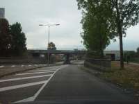
Sketch railway viaduct – Tiel, the Netherlands, 2009 The viaduct is located at the entrance of the city of Tiel. One passes it after leaving the highway and before entering the city. The viaduct shows a various mix of architecture with different styles and no clear visual concept. The viaduct is sadly maintained.
Design ///
/// The 'Fantastic Traffic Objects:
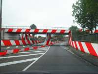
/// We choose to deal with the viaduct as a beacon. We understand the viaduct and its visual content as a landmark, reinforcing the point of recognition.
/// A recognizable pattern that could highlights the viaduct itself and its function, therefore protruding it from its surroundings.
/// The distinction of style and very different forms of architecture is lifted by an uniform and dominant colour pattern.
/// The reflective paint on the viaduct and road reinforce the safety of the road and add some glamour to the run down object.
/// By the red-white colour, it gives to the viaduct a clear signal. Known for a number of signs called red-white stripes, associates that increase alertness and attention to the object itself.
Thus, providing, not only the function of a crossover value, but significantly improved aesthetically without becoming decorative / ornamental.
/// It effect to the aspects of the road. Safety in relation to colour and colour intensity, materials and maintenance:
In the interview, emphasized that, in order to prevent further accidents, on and under the viaduct, measures must be taken soon. In particular, the median should be provided with a clear abduction. A great advantage of this concept is, with the necessary safety features of a municipality, create an artwork, rather than create obstacles, which could compete with the artwork.
/// Material: Red concrete paint mixed with anti-graffiti paint and glass beads (reflection) on the entire railway viaduct. White road paint with glass beads (reflection) on the object.

